Olive

studio case

Why
Olive is a health, wellness and nutrition app. My main goal during this project was to create an app that was more complete than its competition, an app that can help future users with most aspects of a healthy body from just one app.
olive mindfulness screen. meditate, quick exercises, soundscapes, articles and blogs

Main problems I found and focused on

  • The lack of resources like articles to improve overall health on current health apps.
  • Most of the apps only focus on loosing weight and calorie counting
  • The nutritional aspect should be covered as well.
  • Based on my research, I found all the apps focusing on just one part of health instead of trying to cover every aspect of it.
Competitive analyses and interviews
On my competitive analysis and interviews, it was clear that there was a huge need to improve current health apps on the market. There's a lack of resources, most of these apps are not complete or focus on just one aspect of health.
“What I don’t like about health and fitness apps is that they always focus on looks rather than other important things like nutrition and mental health”
“It’s really frustrating that I have to go to an app to see my nutrition and then to another to see my physical activity”

User Personas

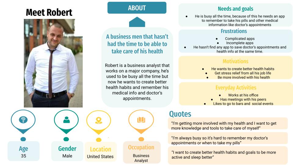
After my analysis and interviews, I created three user personas based on three different audiences: One caring about fitness, another one that is more concerned about her mental health and finding ways to relief her stress, and at last there is another one, that is just starting and wants to be reminded about his medical needs. I focused on adult people, because this is where most of the people start concerning about their health and well being.
Meet cristina, an influencer always wanting to be updated, she works as an influencer and blogger, she writes about fitness and wellness, that's one of the reasons she is always trying to create better health and having new and practical ways to do so it's important to her. needs and goals needs to track her nutrition, she wants to join public challenges to connect with others.
Frustrations most applications are complicated and not easy to use, there's always something missing on the apps.Robert, a business men that hasn't had the time to be able to take care of his health, Robert is a business analyst that works on a major company. He's used to be busy all the time but now he wants to create better health habits and remember his medical info and doctor's appointments. 
Needs and goals, he is busy all the time, because of this he needs an app that helps him remember to take his pills and other medical information like doctor's appointments.Robert, a business men that hasn't had the time to be able to take care of his health, Robert is a business analyst that works on a major company. He's used to be busy all the time but now he wants to create better health habits and remember his medical info and doctor's appointments. 
Needs and goals, he is busy all the time, because of this he needs an app that helps him remember to take his pills and other medical information like doctor's appointments.

Low fidelity wireframes

After creating my user personas, I did some mobile pen sketches and low fidelity wireframes of the main screens. I started by adding the things that the other apps where missing and then I focused on the needs of my user personas.
Main page low fidelity wireframe
This is the main page, at first, one of my solutions was to have graphs that showed the data of the user, in this way, the users would be able to see their data faster and save it in an organized way. This is also great because they have the option to edit this graphs and choose what part of their health they want to see and focus on. The main page focuses on the fitness part of the health.
Profile page
Reminders: here the users could save anything they need to remember, like taking a pill or an appointment with the doctor.
Achievements: this is a good way to keep the users motivated.
Medical information and vitals: here the users could save their health data.
Profile page low fidelity wireframe
Nutrition low fidelity wireframe
Nutrition page
Here the users could find healthy recipes to cook, find the nutritional information of a product, and read articles and blogs about nutrition and health.
Above they could also see a chart with the macronutrients based on their data.

User testing

During my user testing, I tried to test some of the primary sections and functions of the app, looking at their functionality and easiness of navigation.

Analytics

Issue #2: The icons on the navigation bar were not enough to know what each section is about.

Suggested Change: Add the names to the icons.

Evidence: Many participants didn’t know what were the sections about by just looking at the icons at the nav bar.  
Issue #1: The reminders were hard to find for many participants.

Suggested change: Change the reminders to the homepage.

Evidence: Three out of 6 participants couldn’t find reminders at first, and some of them suggested that they would be better placed on the main page.

High fidelity mockups

After applying the suggested changes I made the final high fidelity mockups, adding colors, UI components and styles.
I also changed the charts of the main page to only one, in this way, the users can focus and change the graph based on their needs and what they want to see.
Olive login screen, build better health habits, create a better you.
Main page,  exercises, challenges, sleep graph
Nutrition screen, your macro nutrients, recipes, products, articles and blogs.
Mindfulness page, how is your day going so far? calendar of emotions, meditation, quick exercises, breathe, articles and blogs
View prototype

Conclusion

After making a competitive analysis and interviews, I found that most of the current health and fitness apps on the market don't give enough resources, are incomplete or are only adapted to people that want to lose weight. That's why I built Olive, a health and fitness app that has a lot of variety and fulfills any need a person that wants to improve their overall health. It has physical exercises, customizable graphs that let the user choose what they want to see, resources for mental health like articles and meditation, reminders, and a nutrition page where the users can find healthy resources. It was a challenge to organize all the information, but after some sketches and new versions, I finished it.